JobSync: AI-Powered Privacy-First Job Search Experience

Overview

JobSync is a conceptual browser extension and dashboard designed to help early job seekers take back control of their search by tracking applications, surfacing follow-ups, and bringing relevant information into the process at the right time, without making the experience feel overwhelming. Research was a team effort. I worked alongside Tanvi, Chinnedum, and Ishrar on the competitive review, 11 in-depth interviews with observation sessions, a 44-participant survey, synthesis, and both rounds of usability testing, and was one of the core decision makers shaping research direction. Shaikh led hi-fi design and prototyping. I contributed to lo-fi framing and ideated design directions for the design kit.

00

Problem

Job searching today means managing dozens of applications across multiple platforms, re-entering the same information into every ATS, and waiting with little to no feedback. Most people start with a spreadsheet, abandon it within weeks, and fall back on starring emails in Gmail just to feel some sense of order. The breakdown happens after you hit apply. There's no visibility, no prompts, no connection between what's landing in your inbox and the applications you're tracking.

Who is affected

Early career job seekers, recent graduates, and career changers applying for their first or next professional role. In our survey, 55% were aged 18 to 24, applying anywhere from 5 to 25 jobs a week, often across multiple job titles and industries. They juggle LinkedIn, Indeed, company websites, Excel, and Notion just to keep up, all of it managed on their own across multiple devices, platforms, and inboxes. Over time, this constant context switching becomes mentally exhausting and leads to burnout. AI-powered job search tools are becoming more common, but many users still approach them with caution. There is interest in automation, but concerns around personal data, privacy, and trust make people hesitant to fully rely on these systems during such an important process. The result is a job search that feels effort intensive but offers very little feedback, making it hard for people to measure progress or feel confident that their efforts are paying off.

role

Primary Researcher, Supporting Designer

team

Kalyani Auti, Shaikh Aziz, Ishrar Islam, Chinnedum Ekeh, Tanvi bhakhar
timeframe

2025 (8 weeks)

timeframe

2025 (8 weeks)

tools

Figma, FigJam, Miro, Google Forms

tools

Figma, FigJam, Miro, Google Forms

The Research

Understanding the Experience Before Designing the Solution

Before exploring solutions, we wanted to understand how people actually navigate the job search process, what challenges they face, and where existing systems fall short.

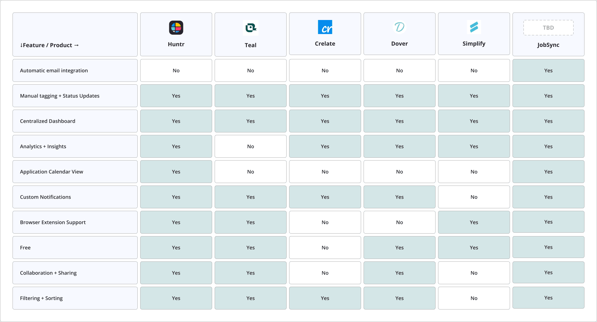
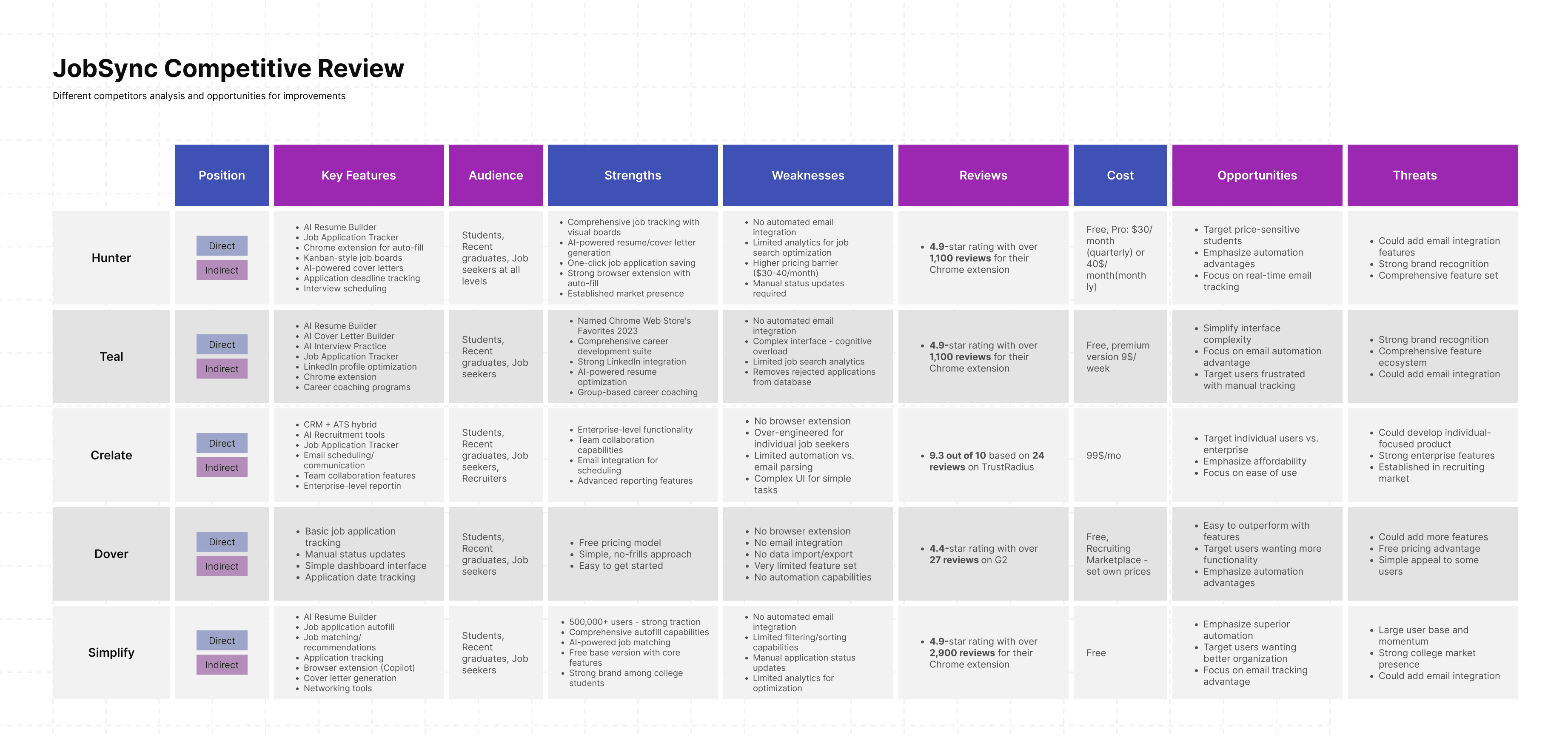
The research included a competitive review of five products (Huntr, Teal, Simplify, Careerflow, and Dover) to understand how current tools approached the problem, 11 in-depth interviews combined with observation sessions, and a survey with 44 participants specifically focused on AI sentiment.

One pattern emerged quickly: the challenge was not just finding jobs, but managing the process itself. Participants struggled with staying organized, keeping track of applications, and managing the mental and emotional strain of prolonged job searching.

We ran each interview and observation as a single combined session, a deliberate choice. Watching participants actually manage their job searches, then asking follow-up questions immediately after observing specific behaviors, produced richer and more accurate data than separate sessions would have.


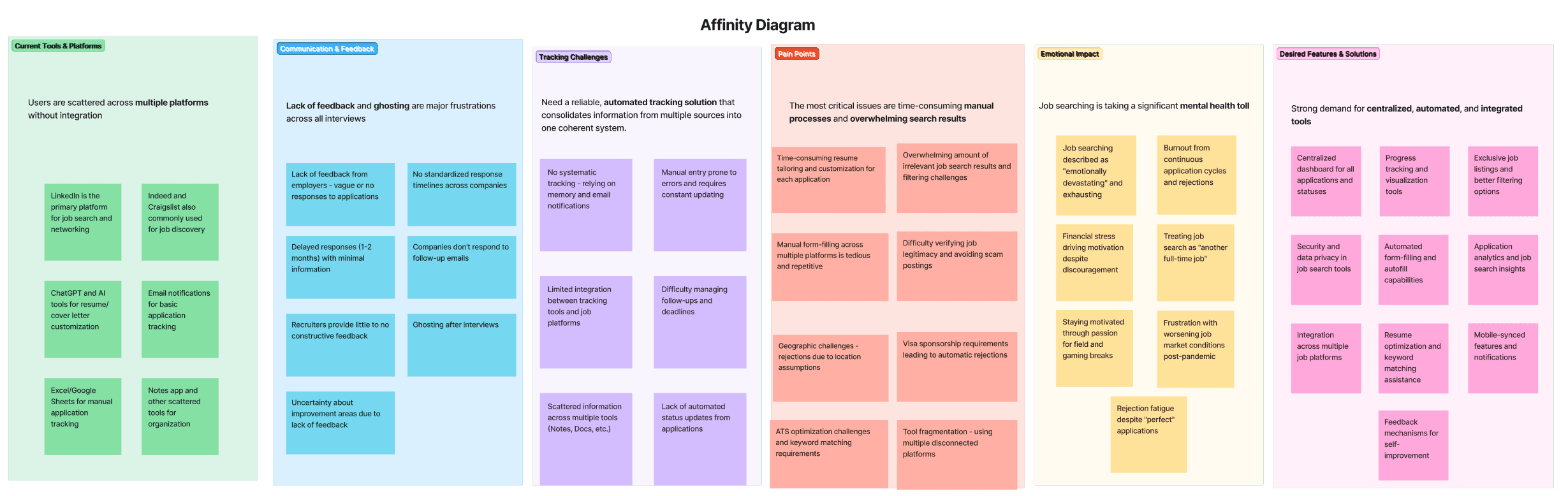
After synthesizing findings into an affinity diagram, four themes rose to the surface consistently:

📭Silence from employers

The single biggest pain point wasn't the volume of applications, it was the near-total lack of feedback after submitting them.

🗂️Fragmented tracking

Every participant used a different makeshift system: Excel, Notion, a separate email inbox, or nothing at all. None felt adequate.

⏱️Manual processes eating time

Copying job details, updating spreadsheets, remembering follow-up dates. All manual, all tedious, all prone to falling apart.

🔒Cautious openness to AI

Survey respondents wanted time-saving automation and resume tailoring from AI, but privacy concerns were the top barrier to adoption.

The Research

Understanding the Experience Before Designing the Solution

Before exploring solutions, we wanted to understand how people actually navigate the job search process, what challenges they face, and where existing systems fall short.

The research included a competitive review of five products (Huntr, Teal, Simplify, Careerflow, and Dover) to understand how current tools approached the problem, 11 in-depth interviews combined with observation sessions, and a survey with 44 participants specifically focused on AI sentiment.

One pattern emerged quickly: the challenge was not just finding jobs, but managing the process itself. Participants struggled with staying organized, keeping track of applications, and managing the mental and emotional strain of prolonged job searching.

We ran each interview and observation as a single combined session, a deliberate choice. Watching participants actually manage their job searches, then asking follow-up questions immediately after observing specific behaviors, produced richer and more accurate data than separate sessions would have.


After synthesizing findings into an affinity diagram, four themes rose to the surface consistently:

📭Silence from employers

The single biggest pain point wasn't the volume of applications, it was the near-total lack of feedback after submitting them.

🗂️Fragmented tracking

Every participant used a different makeshift system: Excel, Notion, a separate email inbox, or nothing at all. None felt adequate.

⏱️Manual processes eating time

Copying job details, updating spreadsheets, remembering follow-up dates. All manual, all tedious, all prone to falling apart.

🔒Cautious openness to AI

Survey respondents wanted time-saving automation and resume tailoring from AI, but privacy concerns were the top barrier to adoption.

How might we…

…help early-career job seekers feel more in control of their search through a low-effort, AI-assisted experience that surfaces timely support without adding complexity or compromising trust?

More specifically, how might we


—> Track applications and progress in one place without information overload

—> Reduce uncertainty around outcomes and next steps

—> Provide timely guidance that keeps users proactive

—> Build momentum, visibility, and control during the search

—> Introduce AI with transparency, privacy, and trust

The Design Principles:

Visibility

The single biggest pain point wasn't the volume of applications, it was the near-total lack of feedback after submitting them. Every screen should answer "where do I stand?"

Guidance

Every participant used a different makeshift system: Excel, Notion, a separate email inbox, or nothing at all. None felt adequate.

Every participant used a different makeshift system: Excel, Notion, a separate email inbox, or nothing at all. None felt adequate.

Trust

Copying job details, updating spreadsheets, remembering follow-up dates — all manual, all tedious, all prone to falling apart.

The Design Process

To keep design decisions grounded in people rather than feature lists, we built two personas from the clusters of behavior we saw across interviews.

These two personas pulled the product in productively different directions. Betty pushed us toward analytics and pattern-recognition, Rafael pushed us toward simplicity and "never lose this again" reliability. JobSync's final feature set had to satisfy both.

Mapping the user's journey

To understand where in the process these pain points actually bite, we built a customer journey map spanning five stages: Discover, Evaluate Fit, Customize and Apply, Wait and Respond, and Organize.

Wait and Respond is the lowest emotional point in the journey. Users have invested effort and get nothing back: no feedback, no timeline clarity, just silence. This is why we prioritized status tracking and AI insight features.

Turning insight into a feature list

With pain points and journey stages mapped, we translated everything into eighteen candidate features, each scored on priority, impact, and feasibility.

The six "High Priority / High Feasibility" features at the top (application tracker, email management, centralized dashboard, status sorting, browser extension, and search) became our MVP scope. Lower feasibility items like AI resume tailoring and cover letter generation (bottom rows) were deliberately deferred; they were high-impact but required more technical depth than we could validate within this capstone.


Sitemap

With a prioritized feature list in hand, we needed to decide how it would actually fit together, what lived where, and how someone would move between pieces without getting lost.

We had Six top-level sections, each holding only what a user would expect to find there: Dashboard for the at-a-glance view, Applications/Job Tracker for the Kanban-style status board, AI Insights for the chatbot and analytics, and My Profile/Settings for everything personal. We deliberately scoped down. Several planned screens were grayed out and cut entirely once we realized they added complexity without addressing a validated pain point.

Low Fidelity Prototype

View Prototype

The Design Process

To keep design decisions grounded in people rather than feature lists, we built two personas from the clusters of behavior we saw across interviews.

These two personas pulled the product in productively different directions. Betty pushed us toward analytics and pattern-recognition, Rafael pushed us toward simplicity and "never lose this again" reliability. JobSync's final feature set had to satisfy both.

Mapping the user's journey

To understand where in the process these pain points actually bite, we built a customer journey map spanning five stages: Discover, Evaluate Fit, Customize and Apply, Wait and Respond, and Organize.

Wait and Respond is the lowest emotional point in the journey. Users have invested effort and get nothing back: no feedback, no timeline clarity, just silence. This is why we prioritized status tracking and AI insight features.

Turning insight into a feature list

With pain points and journey stages mapped, we translated everything into eighteen candidate features, each scored on priority, impact, and feasibility.

The six "High Priority / High Feasibility" features at the top (application tracker, email management, centralized dashboard, status sorting, browser extension, and search) became our MVP scope. Lower feasibility items like AI resume tailoring and cover letter generation (bottom rows) were deliberately deferred; they were high-impact but required more technical depth than we could validate within this capstone.


Sitemap

With a prioritized feature list in hand, we needed to decide how it would actually fit together, what lived where, and how someone would move between pieces without getting lost.

We had Six top-level sections, each holding only what a user would expect to find there: Dashboard for the at-a-glance view, Applications/Job Tracker for the Kanban-style status board, AI Insights for the chatbot and analytics, and My Profile/Settings for everything personal. We deliberately scoped down. Several planned screens were grayed out and cut entirely once we realized they added complexity without addressing a validated pain point.

Low Fidelity Prototype

View Prototype

Usability testing

We tested the same four tasks twice and watched them improve.

During each session, we followed the same structure: pre-test questionnaire, four scenario based tasks with think aloud narration, and a post-test debrief including Net Promoter Score. Round 1 ran with seven participants on the mid fidelity prototype; Round 2 ran with six participants on the high fidelity version.

During each session, we followed the same structure: pre-test questionnaire, four scenario based tasks with think aloud narration, and a post-test debrief including Net Promoter Score. Round 1 ran with seven participants on the mid fidelity prototype; Round 2 ran with six participants on the high fidelity version. Three of four tasks improved between rounds. AI insights did not, and that taught us the most.

On the AI Insights regression: success dropped from 86% to 83% and errors rose between rounds. Time on task improved, but the interaction model itself was the problem, which is why rebuilding the AI entry point tops my list of what I would change.

NPS: NPS moved from 7.21 in Round 1 to 7.83 in Round 2.

Task

Success R1
—>R2

Error Rate R1
—>R2

Avg. time R1
—>R2

Key change

Onboarding

100% —>100%

42% —>0%

Errors eliminated

3:35 —> 2:39

Step indicator added; condensed to 3 core screens; removed quick tip overload

Save a Job

100% —>100%

42% —> 50%

State change needs stronger affordance

0:57 —> 1:10

Color + animation on save; removed redundant "saved" page

Update status

57% —>100%

100% —> 16%

major improvement

2:03 —> 0:48

Deleted parallel path; added direct status dropdown on tracker cards

AI insights

86% —>83%

43% —> 50%

preselection still creates friction

2:38 —> 1:26

Rewrote prompts to be actionable; added expand/collapse

Reflection

What I'd change, and what I'm taking forward

What would I do differently?

I'd rebuild the AI entry point. In both test rounds, users tried to open the chatbot without selecting a job card first. Color and labeling failed to fix it. The navigation model itself was wrong. I would incorporate the insights inside each job card, not on a separate page.

Where did the research fall short?

Our 44 survey respondents skewed young. 55% were aged 18 to 24. That limited what we could claim about mid-career seekers like Rafael. We also tested a simulated prototype instead of a live extension. Friction around the save animation and email integration stayed invisible as a result.

What would I test next?

I would test an interview prep mode that triggers when a status changes to "Interviewing." Company research, shared interview experiences, role-specific prompts. One open question would drive the test: do people use these at the moment they need them, or does more content overwhelm them at the most stressful point in the search?

What did I learn?

Staying open when research contradicts you takes real effort. We assumed more features and more AI would reduce stress. Users asked for fewer features that worked reliably, with their privacy protected. We rebuilt around what they said.

I understood "build what users need, not what you can build" long before this project. But the clearest lesson came from watching a user struggle with a feature we were proud of. It confirmed what the research already told us.

.say hello

.say hello