
Redesign the Information Architecture of Alameda County Website
Overview
Acgov.org is the official website of Alameda County, California, the primary way residents access county services online. This project redesigned the site's information architecture into a topical structure organized around resident needs, validated through five rounds of card sorting and two rounds of tree testing. This was a two-person academic project with Shannon Dang. We shared the content inventory, sitemap drafting, and card sorting. I selected the site, ran card sort rounds 1 through 3, conducted both tree testing rounds, and synthesized the insights that shaped each iteration. Shannon ran all five card sort rounds and built the personas.
00

Problem
A flat, department-driven structure that ignored how people think about their needs. Alameda County's official website acgov.org organized all government services alphabetically under a single "Services" section. To find anything, residents had to already know the exact name of what they were looking for. A single mother needing food assistance, a new citizen trying to register to vote, or a parent needing a birth certificate all faced the same barrier: a flat, department-driven structure that ignored how people actually think about their needs. The goal was to redesign the navigation from an alphabetical, department-based structure into a topical one, organized around resident needs, not county org charts. We rebuilt the structure around what people are trying to do, using five rounds of card sorting and two rounds of tree testing to get there.
role
IA research & design
team
Kalyani Auti, Shannon Dang
tools
Optimal workshop, Miro, Google sheets
tools
Optimal workshop, Miro, Google sheets
The Process
Step1 : Content Inventory
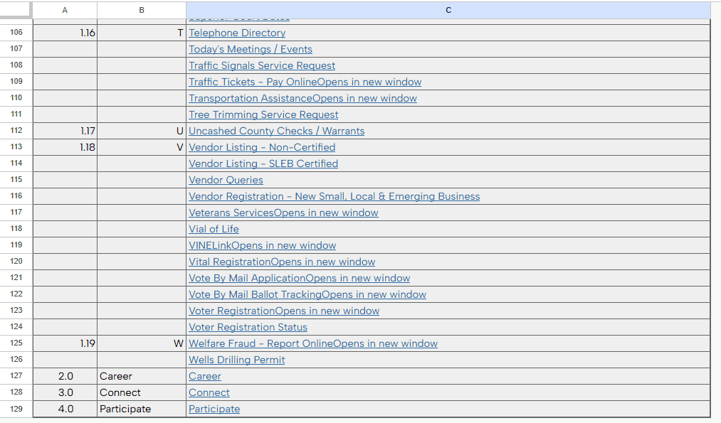
We audited the existing site and identified four main sections: Services, Careers, Connect, and Participate. Services contained everything, organized alphabetically with no topical grouping. We also found content overlap: Board of Supervisors meetings appeared in both Services and Participate under different labels, creating redundancy and confusion. Careers and Connect were footer-level items presented as primary navigation.
This audit gave us the raw material for card sorting and the baseline we were redesigning from.
Step 2: Card Sorting (5 iterative rounds)
We ran five rounds of open and hybrid card sorting with 57 total participants to understand how residents mentally group government services.
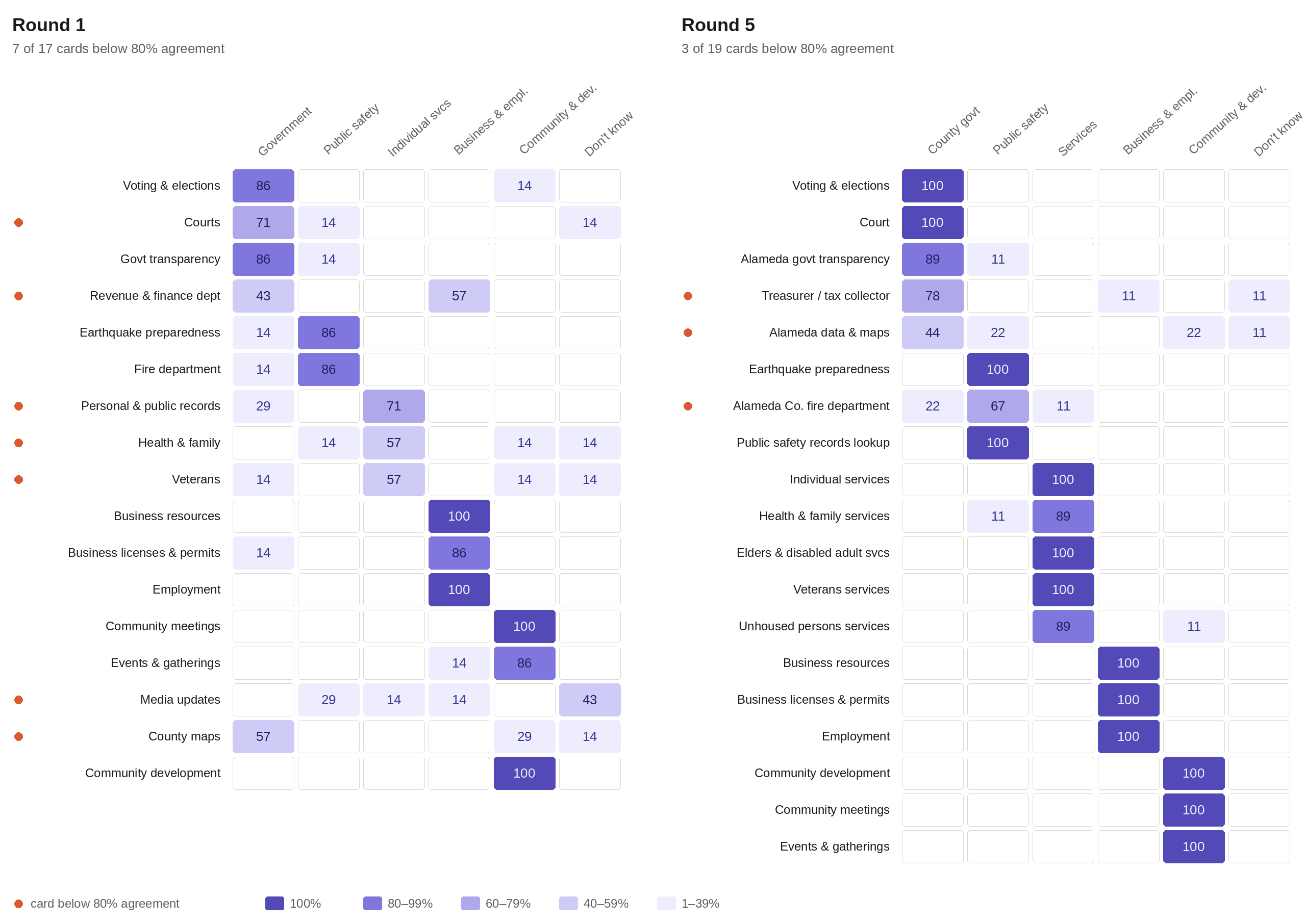
Round 1 (17 cards, 7 participants) showed 7 cards below 80% agreement, including Courts, Veterans, Health & Family, and County Maps. Our initial labels did not match user mental models.
Each round refined the labels where agreement broke down:
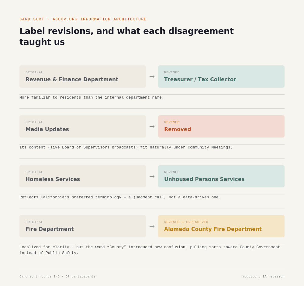
"Revenue & Finance Department" became "Treasurer/Tax Collector", a title residents recognize
"Media Updates" was removed. Its content, live Board of Supervisors broadcasts, fit naturally under Community Meetings
"Homeless Services" became "Unhoused Persons Services", reflecting California's preferred terminology
"Individual Services" split into more specific subcategories after participants confused it with general government services
Cards were localized. "Fire Department" became "Alameda County Fire Department", which introduced new confusion when participants filed it under County Government instead of Public Safety
By Round 5 (19 cards, 9 participants), most categories passed 80% agreement. Three outliers remained: Alameda Data & Maps, Alameda County Fire Department, and Treasurer/Tax Collector. All three pointed to naming conventions that needed further iteration.
Step 3 : Sitemap draft
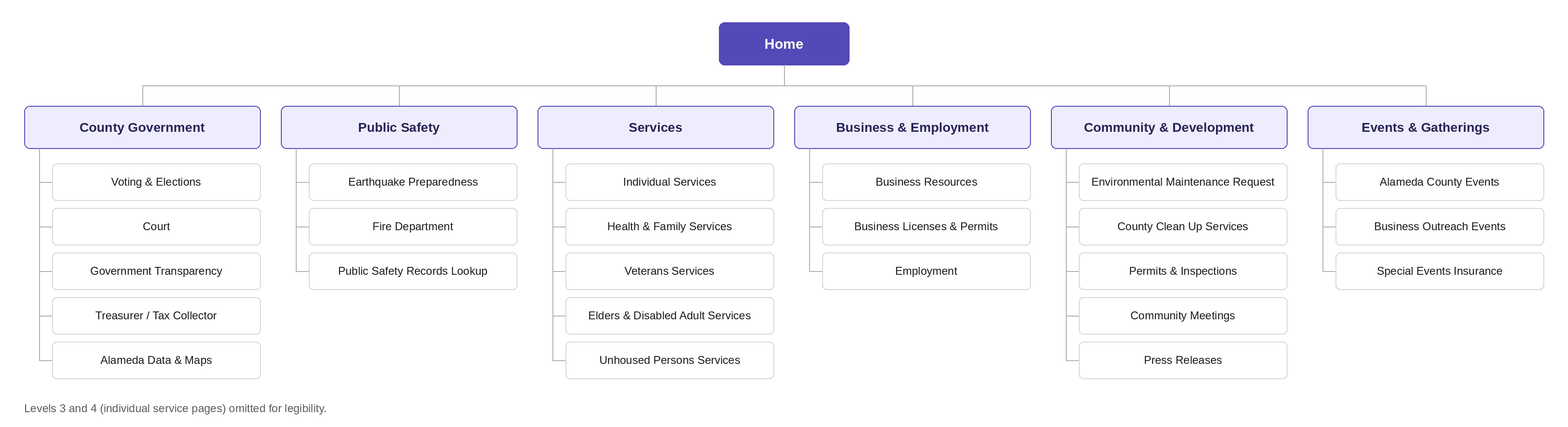
Using card sort data from Round 3, we built an initial sitemap in Google Sheets, moving from broad categories at the top to specific pages below. The draft exposed two gaps: content had not been localized to Alameda County, and Public Safety Records Lookup was missing entirely. This draft became the baseline for tree testing.
Step 4 -Tree Testing (2 Rounds)
Using card sort data from Round 3, we built an initial sitemap in Google Sheets, moving from broad categories at the top to specific pages below. The draft exposed two gaps: content had not been localized to Alameda County, and Public Safety Records Lookup was missing entirely. This draft became the baseline for tree testing.
Step 4: Tree testing (2 rounds)
We tested the sitemap with navigation tasks built around our three personas.
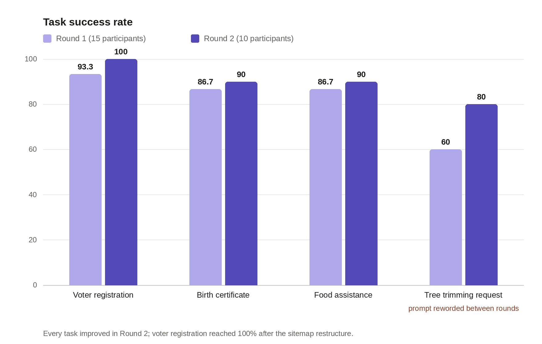
Round 1 (15 participants, 4 tasks):
Voter registration: 93.3% success, avg 18 seconds
Birth certificate: 86.7% success, avg 28.7 seconds
Food assistance: 86.7% success, avg 23.7 seconds
Tree trimming request: 60% success, avg 45.9 seconds, the weakest task
The tree trimming task exposed a flaw in our own test design. The prompt mentioned "almost missing a stop sign", so participants reasonably looked under Public Safety instead of Community & Development, where the answer lived. The prompt was misleading them, so we rewrote it for Round 2.
Round 2 (10 participants, same 4 tasks):
Voter registration: 100% success, avg 17.1 seconds
Birth certificate: 90% success, avg 21 seconds
Food assistance: 90% success, avg 24.1 seconds
Tree trimming (reworded prompt): 80% success, avg 36.9 seconds
Every task improved. Voter registration reached perfect success after the sitemap restructure. Tree trimming rose from 60% to 80% through prompt rewriting alone, evidence that task framing shapes whether users find the right path.
The Process
Step1 : Content Inventory
We audited the existing site and identified four main sections: Services, Careers, Connect, and Participate. Services contained everything, organized alphabetically with no topical grouping. We also found content overlap: Board of Supervisors meetings appeared in both Services and Participate under different labels, creating redundancy and confusion. Careers and Connect were footer-level items presented as primary navigation.
This audit gave us the raw material for card sorting and the baseline we were redesigning from.
Step 2: Card Sorting (5 iterative rounds)
We ran five rounds of open and hybrid card sorting with 57 total participants to understand how residents mentally group government services.
Round 1 (17 cards, 7 participants) showed 7 cards below 80% agreement, including Courts, Veterans, Health & Family, and County Maps. Our initial labels did not match user mental models.
Each round refined the labels where agreement broke down:
"Revenue & Finance Department" became "Treasurer/Tax Collector", a title residents recognize
"Media Updates" was removed. Its content, live Board of Supervisors broadcasts, fit naturally under Community Meetings
"Homeless Services" became "Unhoused Persons Services", reflecting California's preferred terminology
"Individual Services" split into more specific subcategories after participants confused it with general government services
Cards were localized. "Fire Department" became "Alameda County Fire Department", which introduced new confusion when participants filed it under County Government instead of Public Safety
By Round 5 (19 cards, 9 participants), most categories passed 80% agreement. Three outliers remained: Alameda Data & Maps, Alameda County Fire Department, and Treasurer/Tax Collector. All three pointed to naming conventions that needed further iteration.
Step 3 : Sitemap draft
Using card sort data from Round 3, we built an initial sitemap in Google Sheets, moving from broad categories at the top to specific pages below. The draft exposed two gaps: content had not been localized to Alameda County, and Public Safety Records Lookup was missing entirely. This draft became the baseline for tree testing.
Step 4 -Tree Testing (2 Rounds)
Using card sort data from Round 3, we built an initial sitemap in Google Sheets, moving from broad categories at the top to specific pages below. The draft exposed two gaps: content had not been localized to Alameda County, and Public Safety Records Lookup was missing entirely. This draft became the baseline for tree testing.
Step 4: Tree testing (2 rounds)
We tested the sitemap with navigation tasks built around our three personas.
Round 1 (15 participants, 4 tasks):
Voter registration: 93.3% success, avg 18 seconds
Birth certificate: 86.7% success, avg 28.7 seconds
Food assistance: 86.7% success, avg 23.7 seconds
Tree trimming request: 60% success, avg 45.9 seconds, the weakest task
The tree trimming task exposed a flaw in our own test design. The prompt mentioned "almost missing a stop sign", so participants reasonably looked under Public Safety instead of Community & Development, where the answer lived. The prompt was misleading them, so we rewrote it for Round 2.
Round 2 (10 participants, same 4 tasks):
Voter registration: 100% success, avg 17.1 seconds
Birth certificate: 90% success, avg 21 seconds
Food assistance: 90% success, avg 24.1 seconds
Tree trimming (reworded prompt): 80% success, avg 36.9 seconds
Every task improved. Voter registration reached perfect success after the sitemap restructure. Tree trimming rose from 60% to 80% through prompt rewriting alone, evidence that task framing shapes whether users find the right path.
The Process
Step1 : Content Inventory
We audited the existing site and identified four main sections: Services, Careers, Connect, and Participate. Services contained everything, organized alphabetically with no topical grouping. We also found content overlap: Board of Supervisors meetings appeared in both Services and Participate under different labels, creating redundancy and confusion. Careers and Connect were footer-level items presented as primary navigation.
This audit gave us the raw material for card sorting and the baseline we were redesigning from.
Step 2: Card Sorting (5 iterative rounds)
We ran five rounds of open and hybrid card sorting with 57 total participants to understand how residents mentally group government services.
Round 1 (17 cards, 7 participants) showed 7 cards below 80% agreement, including Courts, Veterans, Health & Family, and County Maps. Our initial labels did not match user mental models.
Each round refined the labels where agreement broke down:
"Revenue & Finance Department" became "Treasurer/Tax Collector", a title residents recognize
"Media Updates" was removed. Its content, live Board of Supervisors broadcasts, fit naturally under Community Meetings
"Homeless Services" became "Unhoused Persons Services", reflecting California's preferred terminology
"Individual Services" split into more specific subcategories after participants confused it with general government services
Cards were localized. "Fire Department" became "Alameda County Fire Department", which introduced new confusion when participants filed it under County Government instead of Public Safety
By Round 5 (19 cards, 9 participants), most categories passed 80% agreement. Three outliers remained: Alameda Data & Maps, Alameda County Fire Department, and Treasurer/Tax Collector. All three pointed to naming conventions that needed further iteration.
Step 3 : Sitemap draft
Using card sort data from Round 3, we built an initial sitemap in Google Sheets, moving from broad categories at the top to specific pages below. The draft exposed two gaps: content had not been localized to Alameda County, and Public Safety Records Lookup was missing entirely. This draft became the baseline for tree testing.
Step 4 -Tree Testing (2 Rounds)
Using card sort data from Round 3, we built an initial sitemap in Google Sheets, moving from broad categories at the top to specific pages below. The draft exposed two gaps: content had not been localized to Alameda County, and Public Safety Records Lookup was missing entirely. This draft became the baseline for tree testing.
Step 4: Tree testing (2 rounds)
We tested the sitemap with navigation tasks built around our three personas.
Round 1 (15 participants, 4 tasks):
Voter registration: 93.3% success, avg 18 seconds
Birth certificate: 86.7% success, avg 28.7 seconds
Food assistance: 86.7% success, avg 23.7 seconds
Tree trimming request: 60% success, avg 45.9 seconds, the weakest task
The tree trimming task exposed a flaw in our own test design. The prompt mentioned "almost missing a stop sign", so participants reasonably looked under Public Safety instead of Community & Development, where the answer lived. The prompt was misleading them, so we rewrote it for Round 2.
Round 2 (10 participants, same 4 tasks):
Voter registration: 100% success, avg 17.1 seconds
Birth certificate: 90% success, avg 21 seconds
Food assistance: 90% success, avg 24.1 seconds
Tree trimming (reworded prompt): 80% success, avg 36.9 seconds
Every task improved. Voter registration reached perfect success after the sitemap restructure. Tree trimming rose from 60% to 80% through prompt rewriting alone, evidence that task framing shapes whether users find the right path.
The Process
Step1 : Content Inventory
We audited the existing site and identified four main sections: Services, Careers, Connect, and Participate. Services contained everything, organized alphabetically with no topical grouping. We also found content overlap: Board of Supervisors meetings appeared in both Services and Participate under different labels, creating redundancy and confusion. Careers and Connect were footer-level items presented as primary navigation.
This audit gave us the raw material for card sorting and the baseline we were redesigning from.
Step 2: Card Sorting (5 iterative rounds)
We ran five rounds of open and hybrid card sorting with 57 total participants to understand how residents mentally group government services.
Round 1 (17 cards, 7 participants) showed 7 cards below 80% agreement, including Courts, Veterans, Health & Family, and County Maps. Our initial labels did not match user mental models.
Each round refined the labels where agreement broke down:
"Revenue & Finance Department" became "Treasurer/Tax Collector", a title residents recognize
"Media Updates" was removed. Its content, live Board of Supervisors broadcasts, fit naturally under Community Meetings
"Homeless Services" became "Unhoused Persons Services", reflecting California's preferred terminology
"Individual Services" split into more specific subcategories after participants confused it with general government services
Cards were localized. "Fire Department" became "Alameda County Fire Department", which introduced new confusion when participants filed it under County Government instead of Public Safety
By Round 5 (19 cards, 9 participants), most categories passed 80% agreement. Three outliers remained: Alameda Data & Maps, Alameda County Fire Department, and Treasurer/Tax Collector. All three pointed to naming conventions that needed further iteration.
Step 3 : Sitemap draft
Using card sort data from Round 3, we built an initial sitemap in Google Sheets, moving from broad categories at the top to specific pages below. The draft exposed two gaps: content had not been localized to Alameda County, and Public Safety Records Lookup was missing entirely. This draft became the baseline for tree testing.
Step 4 -Tree Testing (2 Rounds)
Using card sort data from Round 3, we built an initial sitemap in Google Sheets, moving from broad categories at the top to specific pages below. The draft exposed two gaps: content had not been localized to Alameda County, and Public Safety Records Lookup was missing entirely. This draft became the baseline for tree testing.
Step 4: Tree testing (2 rounds)
We tested the sitemap with navigation tasks built around our three personas.
Round 1 (15 participants, 4 tasks):
Voter registration: 93.3% success, avg 18 seconds
Birth certificate: 86.7% success, avg 28.7 seconds
Food assistance: 86.7% success, avg 23.7 seconds
Tree trimming request: 60% success, avg 45.9 seconds, the weakest task
The tree trimming task exposed a flaw in our own test design. The prompt mentioned "almost missing a stop sign", so participants reasonably looked under Public Safety instead of Community & Development, where the answer lived. The prompt was misleading them, so we rewrote it for Round 2.
Round 2 (10 participants, same 4 tasks):
Voter registration: 100% success, avg 17.1 seconds
Birth certificate: 90% success, avg 21 seconds
Food assistance: 90% success, avg 24.1 seconds
Tree trimming (reworded prompt): 80% success, avg 36.9 seconds
Every task improved. Voter registration reached perfect success after the sitemap restructure. Tree trimming rose from 60% to 80% through prompt rewriting alone, evidence that task framing shapes whether users find the right path.
.say hello
.say hello